teacher training etiketine sahip kayıtlar gösteriliyor. Tüm kayıtları göster

28 Kasım 2011 Pazartesi

A cautionary tale ... whatever

But
Front cover
A colleague told me about Whatever by William Bee, and when it arrived, sometime over the summer holidays, I immediately took to its clever simplicity.  I laughed outloud on the first read, then returned slowly to take in the different parts and look carefully at the illustrations.  
Anyone remember those silly tales about boys who ran away from their nurses, and were eaten by lions or girls who told lies and were burned to death? 19th century children's literature at its best and probably the most well known collection, Cautionary Tales for Children by Hilaire Belloc, is still available in ever more modern editions. Whatever has that cautionary tale feel to it, and a lovely retro look too.  
Our protangonist stands, arms outstretched, on the front cover.  He's dressed like a miniature business man, and you can just imagine the kind of child he is ... prim and proper and ever so annoying. 
Back and front covers
If you open out the book, you'll find the back cover is the mirror image of the front.  Witty!  Endpapers are nice and decorative too.  
Front endpapers
I'm wondering whether Willaim Bee has been influenced by 1950's wall paper designs for this pattern? The title page is plain and simple: contains the title, the author/illustrator's and the publisher's names. But the facing copyright page is neat.
Copyright page
One bare tree - all its leaves are lined up on the endpapers - and can you see the way some letters have been enlarged in bold?  (If you click on the image you can see better) What do they say?  "Whatever", yeah, who gives a damn about the copyright blurb?
This picturebook uses lots of white space.  It contributes to pacing the narrative, makes us pause and look as the information is given to us in bits as we turn the pages. 
Opening 1
First we are shown Billy (diminutive of William, by the way), hands down now, the half smile stuck on his face, looking bored.   Then we meet Billy's Dad.  
Opening 2
He's a bigger version of Billy, the only difference being his hat, his larger feet and his bushier eyebrows ... oh and his exuberance.  It's oozing off this page already.  
And so we begin.  Our problem is that Billy is difficult to please.  Dad is exuberantly waving puppets, while discarded soldiers are left behind and Billy looks away uninterested.  
Opening 3
Show Billy something very tall ... 
Opening 4


"And he'll say 'whatever'".  (Love the way the book has to be turned to portrait for the giraffe). 

Opening 5
Notice as you turn the pages how Billy's face shows all sorts of expressions: surprise, disgust, disinterest, annoyance - all with those simple dots for eyes, angled lines for eyebrows and a little red mouth that moves mostly downwards.  
And so we continue showing Billy "something very small" (pretty butterflies); the world's curliest trumpet (and it really is curly!); the world's bounciest castle, and he always says "Whatever".  
Opening 9
Take him on the world's steamiest train (there's even a fish leaping around!), or "fly him to outer space" ... what does he say? "Whatever". And so what happens when Dad tries to scare him with the world's hungriest tiger?  Why, Billy says "Whatever" of course!
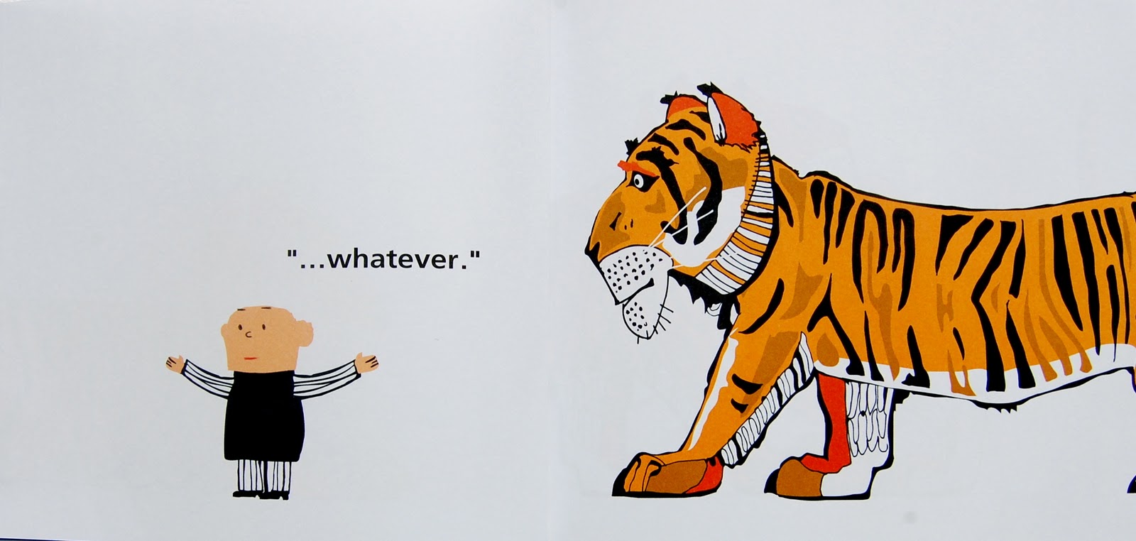
Opening 10
Isn't he a handsome tiger? And a hungry one too ...
Opening 11
Oops!  All but Billy's shoe is swallowed.  Lots of lovely white as the tiger plods off. 
Opening 13
Can you see the tiger's bulging tummy?  And Billy decides it's time to say something ..."Dad! I'm still in here you know".  Guess who's leading the tiger away from the story, and  what do you think he says when he hears Billy?  I'll leave you to guess!

Reviews describe this as being a picturebook for all ages.  Absolutely right.  It could be used in primary, where everyone will quickly call out "Whatever!", or with teens, where they will mutter "Whatever" under their breath!  Get them to say "Whatever" in a dozen different ways, using Billy's facial expressions as clues to his mood.  With these students, you might also want to show them some of the original cautionary tales for fun.  And with adults in a teacher training context use this picturebook for them to see how cleverly words and pictures can be used to create irony and humour suitable for a wide range of ages. 

And if you really want to ensure there's a bit of formal language work, why not have some fun with superlatives, they're even highlighted in the verbal text - what more could we ask?

But most of all, it's a great little picturebook.  Great for just reading and sharing and laughing together over.  

I was prompted to feature it on my blog when I saw it had recently been published in Portuguese by one of my favourite Portuguese publishers, Planeta Tangerina.  Well done them for bringing it into Portugal.  Well done me for featuring it on my blog!

22 Mart 2011 Salı

Hen + Fox = cartoon-inspired comedy

When I tell you the hen is called Rosie you will all know which story I'm going to discuss in this post: Rosie's Walk, a 1960's classic.  Yep!  It didn't win an Oscar or get nominated for a BAFTA, but it's a picturebook and a short animated film.  I'm going to talk about Rosie's Walk as it represents a number of similar picturebooks which are available in animated format, The very hungry caterpillar, Where the wild things areMeg and Mog.  The Gruffalo was also recently released as an animated film, but with a cast of famous voices it's of a different league and possibly deserves a post of its own ... another day!  
Why have I chosen Rosie's walk?  For those of you who don't know the classic, written and illustrated by Pat Hutchins in the 1960's, it's a concise 32-word text about Rosie the hen strolling through the farmyard, oblivious of a fox following her. As we turn the pages, the fox gets himself into all sorts of fixes from trying to catch her. As reader (or looker) we are never entirely sure if Rosie knows he's there or not, but children recognize the cartoon-inspired comedy ... one of my 6 year-old students compared it to Tom and Jerry.  It's a brilliant example of 1+1=3.  
I bought the film years ago so it's in video format, and it's a while since I saw it, but you can now buy the DVD version, (not sure it's available on Blu-ray).  It's the book in action with a quaint soundtrack, North American country twangs played on a fiddle. Seeing Pat Hutchins' illustrations on a screen is pretty exciting, she has a wonderful style, and the 1960's limited colour palette is a delight ... you'll notice she's used very few colours, which is typical of early picturebooks using the limited printing capabilities of the time.  As with anything that gets animated, show the children both versions, they provide two different experiences.  And to be honest the reason I want to talk about Rosie's Walk is because it's mathematically challenging (When does 1+1=3?). I'm not entirely sure the animated version does it justice.  Let me know what you think.  
So, the picturebook. It's generally touted for its opportunities for developing emergent literacy  and exposure to prepositional phrases. True enough, the verbal text is large and against a white background, clear and easy to see, and yes, the book contains a number of prepositional phrases.  Many descriptions of the book highlight the fact that the pictures match the words as well.  But Rosie's Walk is far more than easy to read words and exposure to prepositions, and the pictures do far more than just match the words.  
Peritextually it's a delight.  The front cover presents setting and characters.  First time readers can't be sure if Rosie is the fox or the hen, we see both: a hen walking determined into the book, a skulking fox behind her house.  There's a windmill there too, to be visited further into the story.  
I've never seen a hardback version, but I have several paperback editions, published by Walker Books (UK) and Scholastic (USA).  The half title page has a neat little interplay between words and pictures: the title is large and central with the fox above the letters, and the hen positioned under, as though they are hidden from each other: the hunt is on.  
The title page is a whole double spread, a busy illustration, depicting the farmyard and surrounding fields and land. Rosie is in her henhouse, on the verso page, looking across at the farm.  There's no sign of the fox, but we see the places she will visit when we begin to turn the pages: the pond, the haystack next to the goat, the windmill, the fence and the cart and the beehives.  The route is there, and upon revisiting this page children will enjoy talking about the different places and remembering the sequence.  I had some children once who stated matter-of-factly that she would have been much quicker if she'd walked across the title to the beehives!   They also noticed the missing fox.
There’s a whole page set aside for the dedication, written in big bold letters accompanied by a symmetrical decoration of country flowers. It begs to be read out loud and wondered at. 
Pat Hutchins’ decorative style is lovely; her plump, round trees, with rows of leaves and fruit or radiating leaf-covered branches are unmistakable.  She draws Rosie’s feathers and speckled body consistently neat and in place;  she represents the fox’s fur with dots and dashes.  Everything has a precision, which is characteristic of her work.   As the story continues to unfold, there’s a pattern to the sequence that follows: first we are shown and told what Rosie is doing, but additionally we are shown the fox, never mentioned in the verbal text. 
Alternating wordless pages show us how the accident-prone fox tries to catch Rosie but never does, instead he lands on a rake, falls in the pond, sploffs in the hay, gets covered in flour and finally falls into an empty cart which takes him careering into the beehives.   Rosie just keeps on walking apparently oblivious to the chaos behind her! 
This predictive pattern is our motivating page-turner: we know what is going to happen but we have to turn the page to see if we predicted correctly.   We are all saying, “Oh no! He’s going to …”.  So visually this is far more than just illustrations supporting the minimal verbal text: there are two stories, a verbal and a visual.  But it is together that they become funny: the visual brings entertainment to the plodding verbal.  Pat Hutchins deliberately called her story Rosie’s Walk focusing on that plodding, ignoring the fox, a well-kept secret between reader and illustrator.
There are a number of references to this picturebook as a tool for alerting students to how pictures and words can work together.  It’s been used successfully with slightly older children or even teacher trainees, by just reading the verbal text and asking listeners to sketch the scenes in the story, share their sketches and talk about them, then to be shown and read the actual picturebook.  The activity highlights how 1+1=3, becoming a dual narrative full of irony.  
So, when deciding to use Rosie's Walk, don't think it's just a story to be selected for its use of prepositions.  It's far more than that - make the most of it.  It's a superb example of how pictures and words work their magic together.  
As for the animated film, and the animated films of other picturebooks like Rosie's Walk, they are available and children will enjoy them, but they are watched in a different way, they could never replace the picturebook. 


UPDATE!  I've just found the film on YouTube, so here it is for you to see.


11 Kasım 2010 Perşembe

A beautiful book about physical disability

Selecting picturebooks for this month has been difficult.  I wanted a theme, but at the same time I didn't. So I decided to look at titles which I always return to when I want to make a point about the variety of themes picturebooks offer us and the opportunity they provide for discussion and thought.  
I start this November collection with one of my favourite picturebooks, Susan Laughs, created by an author illustrator team, who have worked together on many a picturebook, Jeanne Willis and Tony Ross.  On the front flap of the dust jacket of my hardback edition it says:
"Susan laughs, she sings, she rides she swings.  She gets angry, she gets sad, she good, she's bad.  In fact, despite her physical challenges, Susan is no different from any other child."  
The back cover reads: 
"Without being condescending or preachy, the words, pictures and design of this very simple picturebook show that a physically disabled child is 'just like me, just like you'" 
It's a truely beautiful book to look at, for Tony Ross' illustrations are sublime.  Using coloured crayons, he's created very painterly images, cleverly cross-hatching colours together to give semi-transparent backgrounds.  His figures are solid and full of character, and Susan in particular is a mixture of impish sweet.   Ross is indeed a genius, not just because he can draw so well, but because of the humour he always brings into his work, whether in collaboration with an author, or when illustrating his own work.  Susan laughs is no exception.
The front cover introduces us to Susan on a see-saw, if you open the book out you'll find the back cover is a continuation of the illustration. Daddy is sitting on the other end of the see-saw, he is pushing with his strong legs, and Susan's are dangling loosely.  This is a visual message which will only make sense upon re-readings, and re-lookings.  In my paperback edition, following front matter pages show two framed illustrations of Susan, her grin getting bigger and bigger until on the title page she's in full beam.  
Once again these are images which will only begin to give meaning upon re-encounters - they are non-existent in the hardback edition which fewer teachers will be using. 
The bummff on the back cover highlighted the "words, pictures and design" contributing to the simplicity of the book, and indeed design is cleverly put into use.  Willis has written in verse, and Ross has ensured that the rhythm of the rhyming couplets is reflected in the illustrations, with each spread containing either two square images or four upright rectangular ones, in a sort of repeated pattern.  So we are shown two spreads with large illustrations, then a spread with four smaller ones, several times over, visually supporting the rhythm with which we read in the words.  Each illustration is self contained, framed on the page, leaving a white boarder for the rhyming text. 
Here is an example of Ross' visual humour, in the rhyming couplet: 
"Susan splashes, Susan spins, Susan waves, Susan grins"


Look at how he shows Susan in all these illustrations, with family and friends.  My favourite is Susan imitating the Mona Lisa!
In the sets of four smaller illustrations Ross gives them a connecting narrative sequence, as you can see from the four I've selected below. At the end of the book, appropriately, as though it were also the end of a day with Susan, we see her in bed. 
"Susan feels, Susan fears, Susan hugs, Susan hears."

And not once are we given an inkling that she cannot walk, so much so that when we see the very last page, and we read the words, we immediately go back and check, surely she was using her legs somehwere?  But no... Susan really can do all those things and she's in a wheelchair.
"That is Susan through and through - just like me, just like you."
This title has been used in a children's literature and diversity project run through the British Council Young Learner Centre in Paris.  The activities that have been devised can be downloaded  here.   

But for me, it's reading and looking which are key to this little gem. It's a picturebook to be shared, and then browsed over with or by individual children.  The natural rhythm of the words and their rhymes, make it easy to memorize, and the pictures make us look and look again, with all sorts of visual treasures to discover, and smile at when we do.  


28 Ekim 2010 Perşembe

'It's a book' ... full of laffs!

I got an email from a friend yesterday with silly jokes about computers and what they've done to us since they took over our lives BIG TIME just over a decade ago.  It reminded me of the article I read after comments from a fellow blogger concerning the diminishing number of picturebooks in book shops, and the discussions I've lurked on about the death of the book and 'long live digital'. So I decided to dedicate this post to "It's a Book".  
Lane Smith, the creator of this picturebook wrote: "The reason I made the book? Certainly not to 'throw down the gauntlet', as one critic has stated.  Naw, I just thought digital vs traditional made for a funny premise.  No heavy message, I'm only in it for the laffs.
Laffs?  Lots of them!  It's a brilliant collection of facing pages with much of the information coming from the illustrations, though of course it's the interaction between word and picture that create the humour.
The front cover, as you can see above, stars a book loving monkey; the back cover shows us a jackass, confidently sitting in a chair holding a book and confiring "No... it's a book." The inside pages show us how he discovered the book. 
The endpapers are a warm orange, reflecting the colour tones throughout the book.  (Interestingly the book featured in the story is also an orangly colour.)  We move from warm orange to a dusty blue past a simple dedication and no copyright page. The title page covers a double spread, introducing the characters: 'It's a mouse'; 'It's a jackass' and 'It's a monkey'.  The choice 'jackass', instead of 'donkey' is obvious, but it only hits you when you get to the final page.  
Lane Smith has described the monkey as traditional and the jackass as modern, and visually they are the opposites of each other too.  The pointedness of the jackass radiates speed, modern day efficiency, and relentlessness (using Smith's own word for his character), he's tiny too! The monkey's roundness oozes a slower life, a calmer, ponderous one.  He's enormous next to the jackass!  
Jackass asks lots of questions, 'How do you scroll down?; Do you blog with it?' 
This is one of my favourite facing sets, when we are introduced to the mouse. 'Where's your mouse?'  
Questions continue, 'Can you make characters fight?'  'Can it text?' 'Tweet?' 'Wi-Fi?' 'Can it TOOT?'  Calm traditional monkey keeps replying, 'No, it's a book.' Another fun page is the jackass' reaction to seeing a page of the book, (which is actually 'Treasure Island'). '
'Too many letters.  I'll fix it.' says the jackass! But jackass is eventually tempted to take a good look at the book and time flies, depicted not in the words, as there are none, but in a series of clocks which move from 12.05 to 16.35, but on a good old-fashioned clock with hands! 
The frustrated monkey ends up going to the library, and our mod-con jackass still seems to think the book needs charging.  Back comes our friend the mouse, from under the monkey's hat. 'YOU DON'T HAVE TO...' 

And we all know the answer to that ... 'IT'S A BOOK, JACKASS.'
Following my usual obsession with peritext, I particularly like the way the copyright page is at the back of the book, and includes a bit of bumff about Lane Smith.  Very cleverly done! 
The short, simple sentences in this picturebook are deceptive  - this is a book which works on many levels, playing on our commonly shared understanding of what computers and books do, as well as knowing a little about what certain books contain.  
Lane Smith contributes to a blog called Curious Pages, where he's written about 'It's a book', describing some of the options he made as an illustrator, with the help of his wife, who designs books.  It's well worth visiting.  And there's a book trailer on Youtube, which is fun too. But the book is better!

How could we use 'It's a book' in the classroom?  Well, it's an excellent picturebook for boys! Why not use it to begin discussions about before and after.  Many of our younger students don't know a life without technology, but they could ask parents and grandparents and think about the world before computers became part of everyday life.  Look at some of the verbs like blog, text, tweet, wi-fi ... and scroll ... what is a scroll, and how different is it from the verb to scroll.  I wonder what happened when books began replacing scrolls?  But most importantly, look at the book, read it together with your students and have a good old laff.