I was prompted to write about this picturebook when a friend wrote and told me that the apple pie I had made her as a gift had been eaten by her dog! Oh yes! That's happened to me, made something yummy, leave it on the kitchen top and when I get back it's been wolfed: it has happened to birthday cakes, freshly baked loaves of bread, neatly cut cheese waiting to garnish something, cooling pieces of roast meat and whole Portuguese chouriços ready for the pot! If you have dogs and they are allowed in the kitchen it's what happens!
Front cover
It's not that dogs want to be bad, they just can't help it, they are dogs and when something smells good, it just has to be eaten! The dilemma between wanting to be a good dog and following your instincts is the backbone to this wonderful picturebook by Chris Haughton.
This is Haughton's second picturebook, I wrote about his first, Abit losthere. Chris Haughton is a designer and a picturebook creator, and this is evident when we look at the picturebook, an object in itself, every single part is to be looked at and read, every bit is there for a reason. Using his distinctive psychedelic palette, purple, pink and orange clash brilliantly on his front cover, with George's black nose weighing down the colours and keeping them together. George is lovable, round, larger than life, and twice as big as his owner Harris!
Back cover
... he is loved greatly by both Harry and the cat, as we can see here on the back cover. It's an important image as George needs to be loved at the end of the book ...
Front endpapers
The front endpapers give us a stylised vision of Harry's house, and provide a kind of map, for we will see all these areas, surfaces, objects in the following spreads. It's a neat and tidy house, everything in place. No Harry, no George, just the cat under the table.
Copyright and title page
The copyright and title pages bring us back to the orange colour scheme and show Harry and George, one small the other oversized. If you have a dog, you will recognize the look on George's face, it's that, "Am I going too look?" But no ...
Opening 1
Harry is going out and George is staying in. "Will you be good George?" "Yes!", says George, "I'll be very good!". Harry and George are brightly coloured against a stark white background. The following page is full coloured again ...
Opening2
A trotting George, who is hoping he can behave! The alternation between full coloured spread and colour upon white flows through the first half of the book.
Opening 3
The white background seems to highlight what George sees and thus his dilemma: a brightly coloured cake (and boy it must smell good to a dog!) upon a white background, how could he miss it? He loves cake, but he said he'd be good... and then the question to the reader in words,"What will George do?" and George himself visibly trying to decide what to do. The face we saw on the front cover ... a cliff hanger? a page turner ... why yes, we do want to know what he does don't we?
Opening 4
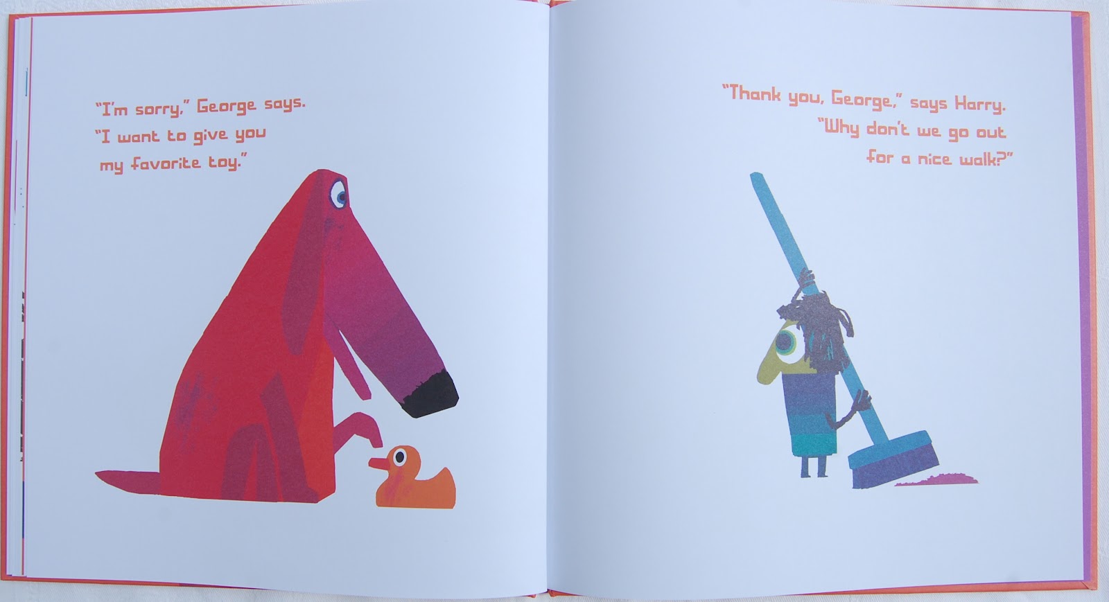
Back to a full colour spread and a we see George doing the thing we know he should not do. KIds love it! They gasp, they cry out "George, no!" They cover their eyes or their mouths. Together we can all say, "Oh no, George!" This happens twice more, George sees cat, he loves to play with cat, "What will George do?"; he sees the dirt in the flower pots, he loves to play with dirt, "What will George do?". We know the answers before we've tuned the pages. Poor George, he just can't help it. Our rhythmic set of spreads changes and suddenly... Harry returns, pleased to see George until he sees what he's been up to. George is so miserable.
Opening 10
This great big pink dog, so full of remorse, and the repeated question, "What will George do?" Dog owners will know...
Opening 11
And Harry is forgiving, isn't he good? So off they go for a walk and we are treated to several more spreads, for this picturebook is longer than 32 pages.
Opening 12
Froliking off into the park, George sees a cake. "Will he eat it?" No... he runs straight past it! And past the dirt and pat the cat. What a good boy George is! But then...
Opening 14
Trash (or rubbish if we come from the UK!), oh my! George's nose is like an arrow, pointing towards the rubbish bin. George loves digging in trash, and so we are asked that question again, "What will George do?". Children are shaking their heads they know what George will do, they are calling out and sighing deeply. They know how difficult it is to be good!
Final verso
But when we turn the page we see that face again and above it the words, "George?" Has he? Hasn't he? My kids are convinced he has! But don't close the book yet! The back endpapers ...
Back endpapers
We are taken back to Harry and George's house, but this time everything is over turned and broken... it is the house after George has had a go at the cake, the cat and the plant pots! Can you see that his duck has moved too? It sort of confirms what happened at the end... George must have gone for the trash can. "Oh no, George!" After we've looked at this picturebook once or twice we can ask the children how easy it is not to do something you really want to do! How do they think George feels and have they ever felt like that? Controlling impulses is not an easy thing and some 5 or 6 year olds find it very difficult. Get them to talk about it a bit, even if in their own languages and not English. A very wonderful picturebook, thank you Mr Haughton, and thank you to Gabriela's dog, who reminded me I had it on my shelf! Forgot to mention the Youtube trailer, which is just perfect ... listen out for the sound effects.
With a cover like this, a picturebook can't fail ... it's Jo Empson's debut. She's fresh out of the Cambridge University MA for children's literature, and one of a number of exciting new talents. A great friend and storyteller, Alec Williams, brought the book to my attention. Not quite sure what adjective to use to describe it as it moves from life to death and back to life again.
The front cover shows Rabbit, our character, very happy and surrounded by paint splodges giving the reader a clue to the special talents our rabbit hero brings to the rabbit community.
The endpapers are delightful, Rabbit in various positions, black shadows against an olive green, showing us all the different activities rabbit enjoys doing...
Front endpapers
The title page opposite the copyright page with a dedication to "... my big brother who liked doing unrabbity things too", shows three rabbits ...
Close up of title page
They are looking in wonder at the title, if we return to this page after we might understand a little better why they are wondering at the word "Rabbityness".
The picturebook continues with openings showing Rabbit doing rabbity things, all shown in Empson's singular watercolour of black and green. The illustrations are placed against a white background, using the grass to anchor the black rabbit figures to a non-existent ground. This reduced, minimal setting, helps us focus upon the character showing us Rabbit's rabbityness. Here he is hopping and jumping ...
Opening 1
On subsequent spreads he is twirling his whiskers, washing his ears, burrowing and sleeping. The verbal text follows rabbit, undulating behind him, over him, through him and under him: it's quite lovely.
Opening 3
Notice here on spread 3 how the font actually slopes downwards in the verso, as "Rabbit likes burrowing". As Rabbit slows down and we are shown him sleeping the verbal text tells us, "Rabbit also liked doing unrabbity things." Upon the page turn we are shown what he likes doing...
Opening 4
Wow! We are shown a page covered in splashes of colour and almost miss the verbal text, which could be redundant anyway, "He liked painting..." Rabbit is holding a paint brush skillfully between his ears and front paws, leaving splodges and splashes in his wake ... lovely! But this colourful life Rabbit leads doesn't stop here...
Opening 5
Musical notes hang in the air like bunting as Rabbit blows skillfully into a didgeridoo. All this makes Rabbit very happy, and we are shown a closeup of his smiling face, just like the one on the front cover. His happiness was catchy and he made all the other rabbits happy too as he "filled the woods with colour and music". We are seeing spreads full of colour, delicate, but happy colour, then we turn the page and ...
Opening 7
We are told Rabbit disappeared and shown a bare spread, with grey leaves falling, a stark contrast to the earlier colourful spreads.
Opening 8
The woods are grey and the other rabbits are sad - the spread oozes sadness. But then the rabbits discover "a DEEP dark hole", left by Rabbit.
Opening 10
Down in the hole, (the words follow the hole downwards) the other rabbits discover that "Rabbit had left them some gifts" ... "things to make colours and music". We can see drums, didgeridoos, paint brushes, and bright bunting, and though it took time these "rabbits discovered they enjoyed doing unrabbity things too". This reminded them of Rabbit and made them happy ...
Opening 13
... and they filled the woods with colour and music again. Rabbit has left these rabbits with a gift to discover their own creativeness. Just look at them all enjoying themselves.
The final spread shows us Rabbit ... his back turned as though he's hopping away. He can leave now he knows his friends have successfully discovered their different talents.
Opening 14
Rabbityness looks at individuality and creativity and, as it does so, the reader is shown how they can deal with the loss of something precious. It's a special picturebook, simple and beautiful and very suitable for younger learners.
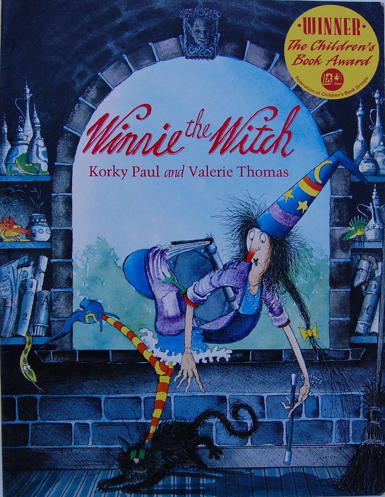
Did you know that Winnie will be 25 on the 13th July? Doesn't she look great?! Illustrated by Korky Paul and written by Valerie Thomas,Winnie the Witch was first published in 1987, she has featured in more than a dozen picturebooks and is also in a series of young fiction titles written by Laura Owen. The cover seen on the left is the original one from 1987, the one on the left is from 2006.
Korky Paul creates his characters and settings by taking "the obvious and imbuing it with that exaggerated and distorted Korky Paul look." He describes how he came upon Winnie's lovely black house, "In 'Winnie the Witch', Valerie Thomas used only one adjective to describe our heroine's home - 'black'. My initial sketches showed a picturesque cottage complete with thatched roof and exposed timber beams. The results were dull boring and obvious. 'What's the opposite of a cottage?' I asked myself Answer: 'Stately Home'. Once I had hit upon this idea the book opened up for me. All the rooms and paraphernalia of a stately home would serve as a wonderful and dramatic back drop for Winnie's antics with her cat, Wilbur. The real challenge lay in illustrating it all in black! "
Let's have a look at the black that links this witchy narrative... Both covers show Winnie falling over her black cat. Korky Paul says he designs his front covers last, and that it is based on "one, or a combination of illustrations from the book." He looks for "a scene that is a synopsis, a visual shorthand of the story without revealing any twists or surprise endings. It must also clearly show the main protaganist." Indeed this front cover does just that, for those of you who know the story, you can nod knowing - this is the problem which sets our story
The end papers ...
Front endpapers
Korky Paul writes: "The endpapers I use as an opportunity to design a bold graphic statement to express the essence of the book. It's an enjoyable exercise and can prove quite difficult to find a neat, simple solution. The splashes of colour I used in 'Winnie' is a good example of a bold graphic design giving a flavour of the story." Upon returning to these endpapers we recognize them as the slashes of colour which emanate from Winnie's wand.
Title page
The title page (it's also the image on the back cover) shows Winnie about to step on her cat, again a clue about the problem she has to overcome in the following pages.
The first opening shows us that wonderfully elaborate black house and the matter of fact description which begins,"... The house was black on the outside and black on the inside ..."
Opening 1
We don't actually get introduced to Wilbur, the black cat, till opening 2. A cosy scene shows Winnie and Wilbur together in apparent domestic bliss...
Opening 2
Everything is black, well shades of black, except Winnie and some dubious green stuff near Winnie's chair. And because Wilbur was black too "... that was how the trouble started."
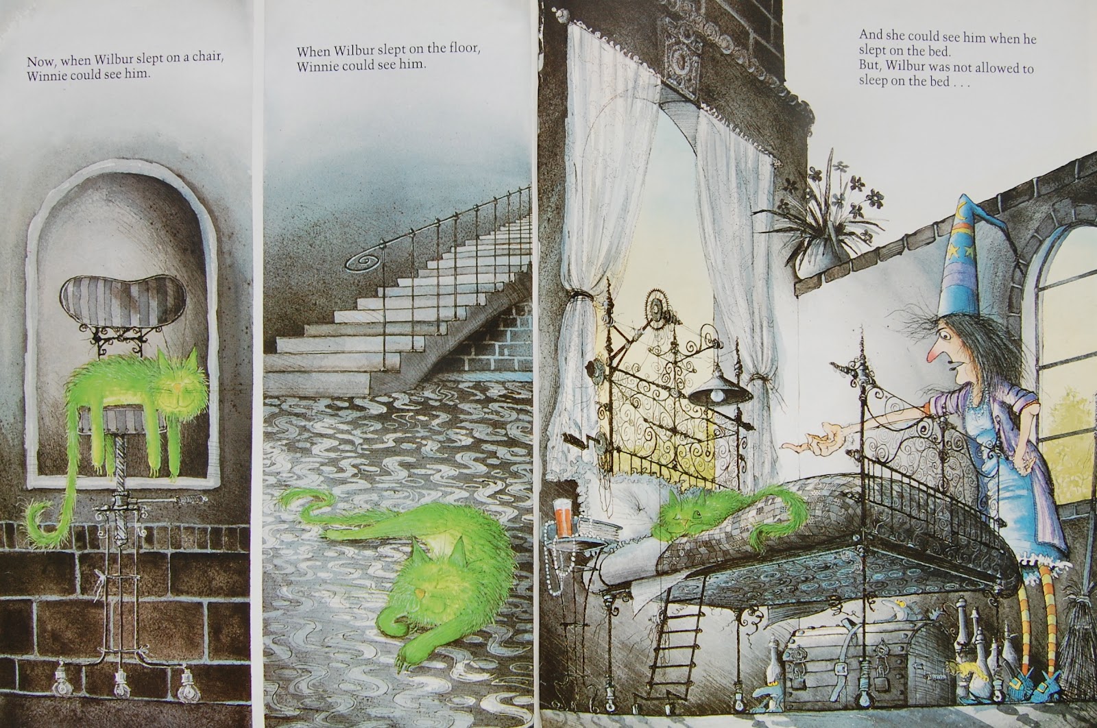
Winnie could see Wilbur if he had his eyes open, for they were green, but as soon as he fell asleep, something cats do lots of, she couldn't see him, so... she sat on him, tripped over him on the carpet or on the stairs. The verbal text is wonderfully repetitive and a joy to read. The illustrations are comic-book-like, appearing in multiple frames, often showing the before and after ...
Opening 5
Opening 5 is one of a series of examples. We see the fall, described as "nasty" by the words and shown as verrrry nasty in the illustrations. So, Winnie does her magic, "ABRACADABRA" and Wilbur is bright green!
Opening 6
Clever Winnie! She can see Wilbur when he "... slept on the chair (...) slept on the floor [and] ... when he slept on the bed." And of course he's not allowed to sleep on the bed! So she sends him outside, onto the lawn ... you can guess what happens of course..."Winnie came hurrying outside, tripped over Wilbur, turned three somersaults, and fell into a rose bush." And Winnie got mad!
Opening 8
Worse than mad... furious! This spread is a great example of the perfect page-turner... we see a furious Winnie, wand splurging colour and the words tell us... "She picked up her magic wand, waved it five times and ..." We know what's going to happen, but we have to turn the page to see.
Opening 9
Wilbur is described in the words, but we are shown how he feels - he is a sad looking cat; we are told that Winnie is happy as she can see him wherever he goes, "... even when he climbed to the top of the tallest tree." And though Wilbur's bright colours focus our gaze upon the top of the tree, if we look down we can see Winnie is looking up at him... Is she worried? Korky Paul uses his cartoon frames on the next spread ...
Opening 10
A desperate Wilbur and over time, a desperate Winnie. So Winnie sensibly change Wilbur back to his lovely black and together, they face the problematic black house and Winnie does her magic...
Opening 12
And that black house we know so well is a lovely yellow one, with a red roof and red doors... and if you compare the black house with the yellow one you will see the bedroom and the bathroom have swapped places! But the important thing is that Winnie can see Wilbur everywhere now.
Korky Paul writes: "In a picture book it is essential these two elements [picture and word] are tightly integrated to tell the story successfully. I frequently use a comic-book layout, which in turn is rooted in cinema. Close-up shots, long-shots, events happening off camera are all cinematic devices used to tell a story effectively and dramatically." Upon returning to this picturebook, one I've taken for granted for so long, I've rediscovered its magic and the reason why Winnie has remained such a successful character, a 25-year old star skillfully created by Korky Paul.
If you don't know the ELT teachers' notes for Winnie written by Jane Cadwallader, do look out for them: lots of fun activities focussing almost entirely on the concepts to be found in this picturebook: colours, bodyparts and furniture. But you don't need these activities, you can just share the picturebook with your students and enjoy the way the pictures and words come together so brilliantly to make a truely funny picturebook. Magical in fact!
If you want to celebrate Winnie's birthday - 25 years is a biggie ... check out her website, and download some fun birthday activities.There's loads to do!
The srticle by Korky Paul I have quoted from can be foundhere.
Underground by Shane W. Evans recently won The Coretta Scott King Book Award, which is given to African American authors and illustrators for outstanding inspirational and educational contributions. I'm writing about it in my blog for I find it visually fascinating, and it awoke a curiosity I could not shake. I've already written about a picturebook which could be read and shared with a view to talking about historical events, The Rabbits, and Underground is another such title. Based on the Underground Railroad, a complex network of people, who helped slaves escape to freedom during the 1800's, it tells the story of how people got to freedom. A minimal verbal texts is accompanied by fabulous illustrations, achieved with a mixture of collage and paintwork. Evans uses a very blue pallet, a night blue, dusky and dark yet everything is clearly visible in its blueness. This blue is partnered with subtle uses of white, sharply cut bits of white. Yellow appears too, moving from representing captors' windows and flaming torches to highlighting and shining upon conductors (those who helped the slaves) and the colour of day and freedom all in one.
Back cover
The picturebook: The front cover portrays fleeing slaves, dark and sinister, the whites of their eyes accentuating their look of fear. Rays of light emanate from behind them, rays of hope possibly. The back cover is not part of a continuous picture, but instead the ending. The endpapers are plain dark blue, the colour of night and as we turn the pages we pass the title page, different only in that it is painted blue and there are a number of stars scattered across it. The first opening also contains the copyright information and a dedication, those dark skinned faces from the front cover appear again, only just visible. We might not know what this story is about, but already we are apprehensive.
Opening 2
Whisper this spread, "The escape.": the leading figure has his finger on his lips as the three creep away. The whites of their eyes shining out at us, looking left, looking right, looking left. In the background you can see the light shining from a curtainless window of the owners' house, that together with the light of the thin crescent moon casts a thin shadow across their bodies. And so each spread opens onto more dark, dusky blue. Shadowy figures hunched across the pages, "We are quiet."...
Opening 4
The yellow in this spread accentuates "The fear." It touches each runaway face like orange tinged caresses, but they remain hidden. Is the torch bearer friend or foe? The sheriff in the background is sending his men elsewhere. And so, "We run. We crawl." ...
Opening 7
"We rest." All but daddy who keeps his eyes open, watching. It seems like an endless night, but it must represent many nights. The next page turn shows us one of the conductors, those in safe houses who helped the fleeing slaves.
Opening 8
"We make new friends:" The yellow light is welcoming, the runaways are inside safe. But their journey continues. "Others help." "Some don't make it." "We are tired." and suddenly we turn the page ...
Opening 11
The yellow light shines as the day begins, lighting a huddle of people. It took me several views to realise that it is a woman and a makeshift mid-wife, for the woman is having a baby, her belly bulging, her bent knees highlighted by the sun. Man and children look on as the wife moans.
Opening 12
"The light." The woman blinks as the light shines upon her face. Is it the woman or the man who declare what's immanent? Or is it the event of birth they are referring to? In Portuguese and Spanish when a woman gives birth they refer to the giving of the light (dar a luz). It's the beginning whatever it is, the light over a new horizon. As we turn the page, the triumphant father holds his child high up and the words tell us, "The sun." The final opening is jubilant :..
Opening 14
"Freedom. I am free. he is free: She is free. We are free."
If we close the book and linger on the back cover, we realise now who the happy family depicted there is. The newly born baby is the center of attention, a child born in freedom.
Evans himself admits that for most of us it is difficult to imagine what being a slave was like, being owned by someone else, someone who dictated what you did, how you did it and when you did it. It is possibly easier to 'relate to opening the door to assist someone.' Many risked their own lives by aiding and abetting runaway slaves. This picturebook cleverly mixes the flight of the slaves with the assistance they were given. Its shapes and colours share an emotion that touches all of us. Could we use this picturebook with students learning history through English? I'd like to think so.
On a website about to this picturebook, Shane W. Evans writes:
In so many ways the simplicity of this book says it all. This experience for me as an author and illustrator was one of the more dynamic experiences in my career. This journey for me was truly one through the lives of a people searching for freedom in their hearts and souls. These journeys lead me "home" in so many ways back to my own community today. If we look around us we can see the spirit of what this movement represented. The idea of freedom is a powerful one that in this world has a duality; this quiet journey of "underground" reflects that in a powerful way. This book not only pays homage to the many that decided to "steal away to freedom" in the 1800's, it pays homage to those that continue the fight for freedom today.
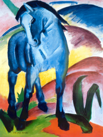
This is one of the many paintings by Franz Marc, a German expressionist at the beginning of the last century. He used vibrant colours to impart emotional values to his paintings: "Blue is the male principle, astringent and spiritual. Yellow is the female principle, gentle, gay and spiritual. Red is matter, brutal and heavy and always the colour to be opposed and overcome by the other two." Eric Carle was shown the work of Franz Marc when he was a child, and his most recent picturebook, The artist who painted a blue horse was created in homage to Franz Marc and his colourful paintings.
Front cover
This is the first post on my blog which features a book by Eric Carle, I've mentioned him once or twice, but not looked at a picturebook in detail. One of the first picturebooks I used and encouraged other teachers to use was Brown Bear, Brown Bear, what do you see? (Bill Martin Jr & Eric Carle), and many of his picturebooks are used really successfully in ELT pre-school and primary classes - my personal favourites are From head to toe, The bad tempered ladybird, Do you want to be my friend?, The mixed up chameleon, The very busy spider, Draw me a star, Today is Monday, Little cloud, Dream Snow, Mister Seahorse as well as the picturebook of all picturebooks, The very hungry caterpillar.
Back cover
The artist who painted a blue horse is created in Carle's characteristic style, collages of colourful paper against painterly backgrounds. The back cover has eight blobs of paint framing his spidery signature. The endpapers are covered in brush strokes of many colours. I'm thinking maybe he's used his waste paper, the piece that covers his work top, on which he tries his paints, overflows onto when using stencils, or splats and splashes as he creates his pieces of art.
Front endpapers
The title page contains the colourful letters from the front cover and our first opening shows us our artist...
Opening 1
"I am an artist" is like "I am a penguin" from his wonderful From head to toe - an indisputable fact - with a colourful palette at hand and a brush full of blue paint, the character could be nothing but an artist.
Our first picture is indeed a blue horse, galloping across the page, as though running home at the end of a day in the paddock.
Opening 2
And our artist continues showing us many brightly coloured animals. A red crocodile, the bubbly water covering his tail. A yellow cow, my favourite, luminous against a dark background dotted with stars.
Opening 4
Then there's a pink rabbit, a green lion, an orange elephant, a purple fox, a black polar bear, and a polka-dotted donkey. The last opening shows us the artist, standing confidently, feet apart, looking out at the reader and the words state quite clearly, "I am a good artist".
Opening 12
Some of Eric Carle's picturebooks have special messages: The mixed up chameleon shows us how important it is that we accept who we are and value differences; The very busy spider helps readers see the importance of not giving up; Mister Seahorse promotes the role of fathers in bringing up their children. The artist who painted a blue horse is no exception, it encourages children to be creative and to use their imagination, to use colours that appeal to them personally and to enjoy colour. But even more importantly it tells teachers and educators that "there isn’t any wrong colour ... and you don’t have to stay within the line. As an artist you are supposed to be free." Anything goes says Mr Carle, and an artist can be a good artist at the flick of a paintbrush.
Better than my own description of this unique picturebook is Eric Carle telling us about it in a short film you can watch on Youtube, made for Puffin Books.
There's also a nice little classroom guide, designed by the penguin group, which can be downloaded here.
Finally, listening to Eric Carle talk about picturebooks, and his life creating them, is a wonderful way to spend an hour, so if you have a hour at hand, do take a peek at the talk he gave at Harvard in April 2010, The education of a good picture writer. It is WONDERFUL and you get a real feel for the boy who made the man, who created so many beautiful books, not to mention the work he has done promoting picturebooks for children through his museum of picture book art.
A big thank you to Eric Carle for all that he has done for children through his books. But a special thank you for this last offering, one I treasure and shall use in all my pre-school classes in the hope that it encourages the children I work with to think they are "good artists" too.