Oliver Jeffers etiketine sahip kayıtlar gösteriliyor. Tüm kayıtları göster

28 Mayıs 2012 Pazartesi

What does it mean to be a Huey?

Front cover
The Hueys in The new jumper is Oliver Jeffers' latest picturebook, and by the title it looks like there's going to be a whole series of them - and the back cover confirms it, "An irresistible new series from award-winning picture book creator, Oliver Jeffers." 
The Hueys ... I remember seeing the blob-like creatures on Jeffers' website, on some design work he had up there, but I went back today and they are gone.  They are great little characters, which is amazing when they are just blobby, bouncing-beanie-kind-of-things with stick legs and arms.  Their penis-like noses hang between two dots for eyes and not all of them have mouths. Yet they are as full of expression as anything. Jeffers has pulled a biggie this time. Here's the promo film, which is up on Youtube.
Simple, no minimal, is probably the best word to describe what Jeffers has done in creating the Hueys.  They are simple little creatures, black and white, making a black and white kind of book.  There are none of those lovely watercoloured pages like in Lost and found or the collaged creations found in The INCREDIBLE book eating boy, but the insertion of a powdery blue page or a delicate pastel green remind me of The great paper caper, which  uses these colours, as does Stuck!  But this minimalism works really well.  
Front endpapers
When we open the book (I have the hard back edition, and it's still not available in paperback) we are presented with five Hueys, parading across the front endpapers
Copyright and title pages
The title page omits the orange from the front cover, cleverly emphasizing the dullness that monotony and black and whiteness can bring to life. Even the blobs are bored saying, "bla bla blabity bla" "mm hmm" ... 
I was surprised, when I turned the page, that Jeffers' characteristic hand written font didn't continue into the body of the book ... it does as we'll see later, but as the Huey voices. That's kind of nice.  So this (is it Times Roman?) font represents that voice over we heard on the Youtube video, like the nice man's voice we hear on children's programmes; a matter of fact sort of BBC-kind-of-voice, can you hear it?
Opening 1
My photos aren't good, but you can just make out that the recto page is beige. First one Huey, then two, the beige background accentuating their minimal form and sameness. Then turn the  page again and ...
Opening 2
It's confirmed, "There were many, many of them..." and they are all the same.  They all look the same, think the same (they all think about drinking tea!) and they do the same things (hang up pictures!), that is until our special Huey "- Rupert was his name -" made himself a jumper. 
Opening 5
Here's where the orange returns, bright, in fact quite stark against the muted pastel and white.  A slashing dash of colour and Rupert looks the bee's knees, though "Not everyone agreed with his taste..."  Look at how a simple line across the nose makes a Huey look uncertain, or just moving the willy nose across makes a Huey look secretive. And Rupert is whistling away, very proud of his new jumper. Keep looking at those Hueys faces.  
Opening 6
These Hueys just don't understand Rupert, the thing that united the Hueys was their sameness.   Rupert found his freind Gillespie, who "thought being different was interesting." So he knitted a jumper for himself, just like Rupert's. 
Opening 8
Now Gillespie was different too, and Rupert didn't look quite "so strange anymore".  Imitation is the greatest form of flattery, and soon lots of Hueys were making jumpers so they could be different too. 
Opening 11
And before you know it, each and every Huey was different. The message being given to everyone makes a mockery of their being different! "Do you like our new jumpers?"  Is this Huey speaking to the rest of the Hueys or is he asking us, the reader? 
Then thank goodness for Rupert, who, true to form, made a mind blowing decision...
Opening 12
He decided to wear a hat! Look at Gillespie's face! "And that changed everything ..." But that's not the end, turn over to see the back endpapers, please!
Back endpapers
Wow the Hueys have gone wild!  Don't they look good?  


So is this picturebook for little kids?  Yes, I htink it would work nicely with early primary, but it would also be a wonderful starting point for discussion with a group of teens or young adults.  If taken at a deeper philosophical level we are looking at how we see identity; just how unique are we and what are the consequences of our actions?  Are we leaders or followers?  Just how important is it to be different and who decides what's different anyway? Oooh!  This simple little book is loaded! 

What's more, these Huey guys are going to be all the rage (mark my words!). You can already make your own Huey here, and there are fun activity sheets here.  Primary children will love these, and so will you, it's such fun!  Here's my Huey ...

From http://www.makeyourownhuey.com/


The Hueys are being marketed, like no other Oliver Jeffers character yet. There'll be Huey t-shirts and Huey mugs.  Watch out! The Hueys are here!

12 Şubat 2012 Pazar

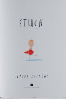
Stuck and completely over the top

Front cover
Stuck by Oliver Jeffers got me gaping and giggling.  It's outrageous, completely silly, but loads of fun.  Great for primary kids who just love taking their imagination to the limit. 
Stuck is Jeffers latest picturebook and its style is very similar to those that have gone before.  He uses stick legged figures, with simple faces, often showing just dots for eyes, maybe with the addition of a line for a scowl.  The character in this picturebook occasionally has a mouth, but never a nose. The illustrations are  a mixture or drawing and painting, creating a very off hand, almost sketchy result.  The use of Jeffer's own hand writing for the font, which even includes crossed out words, adds to the spontaneity of the visual on each spread. 
The title on the front cover not only tells us the title of the picturebook, but also gives us an idea of what happens once we open the book. We don't know this until we begin, but that's one of the wonderful things about picturebooks, we can keep returning to them and making connections.  
Back cover
The back cover shows a furry orange orang-utang in a rather uncomfortable position (flying? being thrown?) across the cover. I wonder why? We'll find out once we read the story.  So let's open it up and look at the endpapers. 
Front endpapers
In very light green, the same green we saw on the front and back covers, the end pages are covered in completely unrelated objects: whales, shoes, a bird, a cat, a tin of paint, a fireman... again we will discover what they represent when we've read the rest of the book. 
Title page
The title page shows us the character we saw on the front cover, carrying his kite.  Here we are at the set up of our story, a boy going out to fly his kite. On the first opening we learn that this boy is Floyd and his problem is...
Copyright and Opening 1
... his kite is stuck in a tree. But the real trouble began when ...
Opening 2
... he threw his favourite shoe up there to knock it down. This is just the beginning of Floyd's many attempts at getting his kite down by throwing things, unexpected things.  If you look at these two openings, you'll notice that the tree was first blue, now it's brown.  It's as though the colours reflect Floyd's feelings.  The next opening shows a different colour again:
Opening 3
You'll also notice that Jeffer's uses capital letters in the verbal text to emphasize certain words, "FAVOURITE" etc. So far we have a kite and two shoes in the tree, you can guess what he's going to do with Mitch the cat, can't you? He throws the cat into the tree to dislodge his shoes. Why, cats often get stuck in trees!  
Opening 4

The next spread is a deep red in verso, lovely. Floyd is worried, what should he do, (that simple line across his eyes representing a knitted brow).  He gets a ladder. We all know what he will do with that ladder, he throws it into the tree instead of climbing up it, in an attempt to knock down the cat. He flings a bucket of paint to knock down the ladder, a duck to knock down the paint, a chair to knock down the duck, a bike for the chair, then a kitchen sink and the front door (which he actually unscrews). And so it gets wilder ...
Opening 8

Next it's "The FAMILY car" and if you look carefully you can see a milkman at the front of the house, wondering where the front door is. And of course he was the next to be thrown up the tree, to knock down the car of course!  Ah, and here's the orang-utang we saw on the back cover.  Where did he come from? And all the other things that follow, "a small boat to knock down the orang-utang", then a "BIG BOAT"; a rhinoceros, a long distance lorry, "the HOUSE across the road", complete with the neighbour inside! How does he manage to throw them up into the tree? It doesn't seem to matter, Floyd has a kind of superhuman strength which goes so far as to fling a lighthouse and a whale. 

Opening 11
Here they all are on opening 11, the tree solidly supporting the mass of objects, getting ever bigger.  The verso page boldly stating that they all got stuck. The words hang above Floyd, as though he is shouting them out, exasperated.  What will happen next? 
Opening 12
Why a fire engine passes by of course, but they don't end up helping as we would expect, up they go "first the engine, followed by the firemen, one by one."  Whatever next? With each object lodging itself in the tree Flyod worries that someone will notice it is missing, he is certain that "Firemen would definitely be noticed missing ..." and that's when he had an idea, a light blue boy against a turquoise blue background, lightbulb and all - a saw. 
Opening 14
But did he saw down the tree?  No!  He threw the saw up at the tree of course!  An down came his kite, "UNSTUCK".  After all the excitement he'd forgotten all about it.   Off he went and had a great afternoon.
Opening 15
In bed at night (lovely black background), he was sure he had forgotten something, and we can see the loaded tree through his bedroom window.  On the very last recto we can make out all the objects in the tree against a dark blue night sky and a fireman is saying, "HANG ON A MINUTE, LADS. I've got an idea ..." 
How do they get down?  Well that's another story!

As is now invariably the case, there's a Youtube film advertising the book, and with Oliver Jeffers himself reading bits.  He has the best Irish accent ever! 

DId you pick up on the repetition?  "Floyd throws the ... to knock down the ...", and a fun activity would be to get children to create trees, using watercolour and scribbles, much as Jeffers has. Don't stick to just green trees, be bold, go for blue, brown, red ... whatever.  Then ask children to cut out four or five different objects from magazines or pamphlets and to retell the story using different objects. "Floyd throws the cake to knock down the ball.  He throws the table to knock down the cake. He throws the BBQ to knock down the table. He throws the  car to knock down the BBQ."  Silly examples, but no sillier than good old Jeffers' and kids have a great time, the only rule being the objects must increase in size.  These "Stuck trees" also make a fun display. 


30 Mart 2011 Çarşamba

Lost and found: a story of friendship

Lost and found is Oliver Jeffers' second book, published in 2005.  It was inspired after a funny event which took place in Belfast, his home town: a group of school children went on a trip to Belfast Zoo, and a child managed to smuggle a baby penguin out of the zoo, into the school bus and all the way home, without anybody noticing.  When it was eventually discovered in the bathroom of his home, the parents kept it overnight in the bath tub, until the zoo came to collect it the next day. It was the talk of the town for days! Lost and Found emerged from this story as an award winning picturebook.  Quite different, but the influence is recognisable.
In 2009, Studio AKA produced a film inspired by Jeffers' picturebook. The film has gone on to win 60 awards, that's right, 60, and its still winning awards, quite amazing - they are listed on the Studio AKA site, if you want to be WOWED! The 2009 BAFTA Award is probably the most prestigious. 
It is a wonderful, really wonderful film, and is very different to the picturebook, yet still contains  the essence of Oliver Jeffers' story and characters. Philip Hunt, who directed the film, admitted to creating a longer story line, as the 32-page picturebook would have given no more than a five-minute film.  What makes it so special is that Oliver Jeffers worked with the studio to create the new storyline and the new look to the story, as well as providing some of the visuals. 
Screen shot from one of the film scenes.
You'll notice the signs are all in his well-known, hand-written, slightly lopsided fonts! If you manage to see the film, the accompanying "How the film was made" is fascinating, as it takes you through the extended storyline and shows how they created the 3D sets and scenery, including the fabulous life-like sea scenes. 
I did have a link to a youtube trailer of the film here - but it's been removed from youtube.  Great pity ... it was a good trailer. 
Jacket flap photo
Oliver Jeffers has been making picturebooks for a decade and his style is recognizable a mile off. Those stubby little figures, with large heads and stick legs belong to no other illustrator.  But, if you visit his website, you'll be surprised when you see his art work, which is very life-like, he is extremely tallented.   I met Oliver in February 2009 at a British Council Seminar, Words and beyond, in Kuala Lumpur.  He talked about  his  work and what impressed me was that his fine art, (paintings and installations / objects), feeds his picturebook artwork and vice-versa - he is a complete artist. Oliver also talked about his interest in how pictures and words work together, the essence of picturebooks. His first picturebook, How to catch a star was created when he was still at art school in Ulster.  He was extremely lucky to get a publishing deal within days of sending off the maquete to Harper Collins USA: every young picturebook illustrator's dream.   As you can see from his photo here, he loves hats, and he wore about six different ones in the four-day seminar we both attended!
I digress!  The picturebook Lost and Found is one of Carol Read's  favourite six picturebooks.  It's a cutie, illustrated in Jeffers' watercolour style,  with pastel tones. Unlike most picturebooks, Jeffers does not use double spreads as whole illustrations, but instead the left and right pages provide the reader with separate sequential steps to the narrative.  Sometimes the ilustrations appear as vignettes, other times as framed illustrations, (sometimes more than one frame per page), and other pages will be covered right to the edges with his watercolour washes: skies and the sea are often portrayed like this. He uses scale very well too, you'll see an example later in this post. 
The front and back covers, when opened out, create a whole scene, the boy and the penguin floating in the cold antartic waters.  This is a culminating image as it is from the end of the story: the friends have been separated and reunited.
The title page is a balmy seaside esplanade, the boy and the penguin walking side by side as though deep in conversation.  The sun setting into a salmon pink sky.  It's a beautiful though odd illustration for a title page, I'd associate it with the ending of the story not the beginning.  
And so we begin our story: "Once there was a boy and one day he found a penguin at his door." It's a sunny illustration, yellow is a positive, happy colour, it's the beginning of a relationship. (My photo doesn't do the colours justice, they are much brighter in the book).
The penguin followed him everywhere, and because the penguin looked sad, the boy presumed it was lost.  So he went to the "Lost and Found Office" and he asked the birds in the park, "But no one was missing a penguin."
Once the boy had discovered that penguins came from the South Pole he decided he had to take the penguin back. So off to the harbour: the right hand page here is fabulous, a huge boat and a tiny boy and penguin. "His voice was too small to be head over the ship's horne." Lovely illustration. 
And so, together with the Penguin, the boy made a boat and they sailed to the South Pole.  Here is where Jeffers' wonderful double spreads come into their own - a great sea scene showing the boy and the penguin in a bad weather "... when the waves were as big as mountains." They remind me of The great wave off Kanagawa, by the Japanese artist Hokusai. 
The boy and the penguin survive the sea adventure and get to the South Pole, where there's a neon sign written in Jeffers' characteristic writing:  "Welcome to the South Pole".  The boy is happy he's arrived, the penguin is sad. There's a great illustration of the boy and the penguin looking at each other, unable to say goodbye, though the words tell us, "The boy said goodbye ... ". The boy leaves the penguin, alone on the edge of an iceberg. "... and floats away.  But as he looks back, the penguin looks sadder than ever."  That's when he began to wonder.  
The illustrations show us the sequence of his thoughts and the sudden realization that, "The penguin wasn't lost. It was just lonely." And so he returns to the iceberg but there's no penguin in sight.  
We know he's not there, because we have been shown the penguin floating back to sea on his umbrella. Can you see him on the other side of the floating berg?  The boy is unaware of this, and so he returns to his boat and rows home. It's a very sad scene,  children audibly take a breath, some adults probably do too.  But as in all good stories, the boy catches up with the penguin  and they hug.  
This is one of the best picturebook hugs ever, just look at how their forms become one, both anchored to the ground together by a single blue shadow.   It's a truly beautiful embrace.  
And so they row back home together, "... talking of wonderful things all the way."
This is my favourite of illustrations.  A warm blue sea, cradling  a single boat with two friends in it.   Jim Broadbent narrates the film, and his final words, said in that Jim Broadbent granddad-like tone he has, are: "This all began with someone lost and someone found, and who's to say which was which?  There was a boy and there was penguin, strangers from the opposite sides of the ocean. And like the beginning of any friendship, theirs is a remarkable story indeed." 
Whenever, I see this last page, and the shot from the film, it I think of the book cover for Life of Pi, and wonder.  (All those intertextual connections we make as individuals.) 

Lost and Found: I like both the book and the film, but they are so very different.  I'd decline from using the film with a group of younger students, just tell the picturebook, it's such an experience - those illustrations accompanied by Jeffer's almost rhythmic prose. It's perfect for just sharing.  The film and the picturebook might get a group of teenagers talking, discussing how the two media can bring such a message across, and how the extras in the film are used to extend the narrative.    
I've just watched the film again, and the theme tune is playing nonchalantly in the background - deep sigh,  it IS such a wonderful film.  Isn't Oliver Jeffers lucky to have been involved in creating two versions of a story that began with a small child and a smuggled baby penguin from Belfast Zoo?