 |
| Original front cover 1987 |
| New front cover 2006 |
Korky Paul creates his characters and settings by taking "the obvious and imbuing it with that exaggerated and distorted Korky Paul look." He describes how he came upon Winnie's lovely black house, "In 'Winnie the Witch', Valerie Thomas used only one adjective to describe our heroine's home - 'black'. My initial sketches showed a picturesque cottage complete with thatched roof and exposed timber beams. The results were dull boring and obvious. 'What's the opposite of a cottage?' I asked myself Answer: 'Stately Home'. Once I had hit upon this idea the book opened up for me. All the rooms and paraphernalia of a stately home would serve as a wonderful and dramatic back drop for Winnie's antics with her cat, Wilbur. The real challenge lay in illustrating it all in black! "
Let's have a look at the black that links this witchy narrative... Both covers show Winnie falling over her black cat. Korky Paul says he designs his front covers last, and that it is based on "one, or a combination of illustrations from the book." He looks for "a scene that is a synopsis, a visual shorthand of the story without revealing any twists or surprise endings. It must also clearly show the main protaganist." Indeed this front cover does just that, for those of you who know the story, you can nod knowing - this is the problem which sets our story
The end papers ...
 |
| Front endpapers |
Korky Paul writes: "The endpapers I use as an opportunity to design a bold graphic statement to express the essence of the book. It's an enjoyable exercise and can prove quite difficult to find a neat, simple solution. The splashes of colour I used in 'Winnie' is a good example of a bold graphic design giving a flavour of the story." Upon returning to these endpapers we recognize them as the slashes of colour which emanate from Winnie's wand.
 |
| Title page |
The title page (it's also the image on the back cover) shows Winnie about to step on her cat, again a clue about the problem she has to overcome in the following pages.
The first opening shows us that wonderfully elaborate black house and the matter of fact description which begins,"... The house was black on the outside and black on the inside ..."
 |
| Opening 1 |
We don't actually get introduced to Wilbur, the black cat, till opening 2. A cosy scene shows Winnie and Wilbur together in apparent domestic bliss...
 |
| Opening 2 |
Everything is black, well shades of black, except Winnie and some dubious green stuff near Winnie's chair. And because Wilbur was black too "... that was how the trouble started."
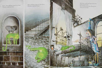
Winnie could see Wilbur if he had his eyes open, for they were green, but as soon as he fell asleep, something cats do lots of, she couldn't see him, so... she sat on him, tripped over him on the carpet or on the stairs. The verbal text is wonderfully repetitive and a joy to read. The illustrations are comic-book-like, appearing in multiple frames, often showing the before and after ...
 |
| Opening 5 |
Opening 5 is one of a series of examples. We see the fall, described as "nasty" by the words and shown as verrrry nasty in the illustrations. So, Winnie does her magic, "ABRACADABRA" and Wilbur is bright green!
 |
| Opening 6 |
Clever Winnie! She can see Wilbur when he "... slept on the chair (...) slept on the floor [and] ... when he slept on the bed." And of course he's not allowed to sleep on the bed! So she sends him outside, onto the lawn ... you can guess what happens of course..."Winnie came hurrying outside, tripped over Wilbur, turned three somersaults, and fell into a rose bush." And Winnie got mad!
 |
| Opening 8 |
 |
| Opening 9 |
Korky Paul uses his cartoon frames on the next spread ...
 |
| Opening 10 |
A desperate Wilbur and over time, a desperate Winnie. So Winnie sensibly change Wilbur back to his lovely black and together, they face the problematic black house and Winnie does her magic...
 |
| Opening 12 |
And that black house we know so well is a lovely yellow one, with a red roof and red doors... and if you compare the black house with the yellow one you will see the bedroom and the bathroom have swapped places! But the important thing is that Winnie can see Wilbur everywhere now.
Korky Paul writes: "In a picture book it is essential these two elements [picture and word] are tightly integrated to tell the story successfully. I frequently use a comic-book layout, which in turn is rooted in cinema. Close-up shots, long-shots, events happening off camera are all cinematic devices used to tell a story effectively and dramatically." Upon returning to this picturebook, one I've taken for granted for so long, I've rediscovered its magic and the reason why Winnie has remained such a successful character, a 25-year old star skillfully created by Korky Paul.
If you don't know the ELT teachers' notes for Winnie written by Jane Cadwallader, do look out for them: lots of fun activities focussing almost entirely on the concepts to be found in this picturebook: colours, bodyparts and furniture. But you don't need these activities, you can just share the picturebook with your students and enjoy the way the pictures and words come together so brilliantly to make a truely funny picturebook. Magical in fact!
If you want to celebrate Winnie's birthday - 25 years is a biggie ... check out her website, and download some fun birthday activities.There's loads to do!
The srticle by Korky Paul I have quoted from can be found here.
Hiç yorum yok:
Yorum Gönder